Design ethics info graphics

Following the general research into info graphics I looked at some specifically concerning the ethics in graphic design.

screen-shot-2015-03-16-at-17-48-02

The above poster outlines the truth behind false advertisement in order to make food items look more appealing than what they are in reality. This being to entice consumers to buy the products to then find out that they are not as good as what they seem in the adverts.

state-of-the-australian-graphic-design-industry-infographic-yoke-large

This info graphic is able to outline what it is like for graphic designers in Australia and the troubles in which they face, this being similar to the ethics of a starving designer. Using a centre image, subheadings and bright colours to separate the information it makes it easy to read and visualise.

infographic-big

The above info graphic describes how graphic design can be made sustainable using a series of statistics, symbols and text. This making the info graphic successful because it the information is evenly spread out on the page allowing each element to be easily seen and read. Also I think that having a colour scheme works well because it allows the piece to look fluent harmonised.

stealing-images-online-vs-using-images-fairly_521ef34d312c7_w587

The last info graphic is about copy righting images and how this can be prevented with the use of ‘imgembed.’ The poster create scenarios using speech bubbles showing what the wrong thing to do is then explaining the correct solution. Again the use of text and imagery along with a fluent colour scheme makes the page look effective and not so harsh to look at.

Following this research I am able to report to my group as to what elements would make our info graphic poster successful for example colour, orientation, type, imagery and the information held on the page.

Info graphics research

As the aim of this brief is to create an info graphic for the ethics of graphic design, I have decided to carry out some research into info graphics and whether there are any themes concerning the design elements. The definition of a info graphic is a visual representation of information or data with the purpose to make it look interesting and engaging.

(Source: https://uk.pinterest.com/search/pins/?q=infographic&rs=typed&0=infographic%7Ctyped)

Above show some examples of info graphics in which I found eye-catching and engaging, I will now describe the similarities between them and how they have been designed to make them attractive.

All of the images above sit vertically and have the information running down the page in order for it to easily be read from top to bottom. They are also very colourful, bright and eye catching with the propose to engage an audience and want them to read the information.

Infographics typically follow a 3/4 colour scheme in order to ensure that it remains consistent and looks harmonious. As seen in the first info graphic royal blue is used to act as a background colour for the type whereas a lighter teal colour and pink has been used as an accent colour for the imagery.

The information is broken up using statistics, graphs and images in order to make it more appealing to read, easier to visualise and not as bulky and boring.

Lastly they all typically follow the same typeface throughout, whether some is written in upper or lower case. The type used is often a bold sans-serif style where the title is written in capitals to make in easier to see and distinguish whilst creating an hierarchy of importance and where to look first. Following this the body copy is often written in lower case with some statical data written in upper case to allow it to stand out from the body copy and easily be read/noticed, especially at a glance because this is the information in which most audiences would find the most interesting as they are learning something new from it in which they can quickly and easily remember.

The first two info graphics act as a mind map and use the information in the act of a journey allowing the audience to easily follow the text and lead to the next piece through the use of arrows and lines.

As our info graphic is based upon a philosophical topic it may be difficult to gain as much information held in the exampled images above. Also there is not as much statistical data involved in ethics for graphic designers. However I think a layout similar to the third image could work successfully for our info graphic as the elements are spread across the page evenly and there is not a lot of information within it as imagery plays the main role. I think that by using more images within our info graphic would be a successful option because it will allow the audience to stay engaged and will catch their attention at first glance.

Communication Arts

As we are designing a poster for Communication Arts magazine I have decided to carry out some research into the magazine and what it entails.

Communication Arts is the largest international trade journal of visual communications and was founded in 1959 by Richard Coyne and Robert Blanchard. The magazine include many topics such as graphic design, advertising, photography, illustration and interactive media. Currently the magazine publishes six issues a year and hosts six creative competitions in graphic design, advertising, photography, illustration, typography and interactive media.

(Source: https://en.wikipedia.org/wiki/Communication_Arts_(magazine))

CommArtsLogo

As we are designing an A2 fold out poster it would need to be folded twice in order for it to fit in Communication Arts magazine. Therefore we would need to make considerations as to where the folds would be placed on the poster and whether we would need to change the layout as to whether there was any essential information held on the folds.

Another consideration which we could make would be to add the Communication Arts logo to our poster in order to create an association to the magazine.

How to be ethical in graphic design

Following the research carried out into David’s code for the starving designer, I have looked at way in which graphic design can be made ethical.

FullSizeRender-2

After gaining this information it is important for designers to set out their own code of ethics in order to be taken seriously in the industry and to work professionally with clients.  Creating this spider diagram allows myself to understand the ethics in graphic design further whilst also generate ideas as to what the group poster could be about.

Ethics for the starving designers

The ethics of graphic design are difficult to judge as there are many responsibilities and constraints that follow them. They differ in the industry depending on the situation and content of work which is being asked, also the personal morals of the designer along with the reputation in which they wish to uphold.

David is a student in Singapore who has come to the realisation that he is entering an industry that is particularly responsible for the worst things in the world, this being graphic design.

For example most design purposes are to promote and advertise products in a positive and enticing light even if they are not morally of ethically correct. These could be products such as tobacco, alcohol and beauty which could lead to smoking, alcoholism and eating disorders.

David took this realisation on board to understand that there are choices and responsibilities in graphic design and that the context of a piece of design is the primary concern. Whether you take the context and responsibilities on board determines whether you are a successful and ethical designer.

HOWEVER..

Being an ethical designer is not a simple as it sounds because for a starving designer such as David not everyone is able to choose the context they work with despite whether they agree with it or not. Priorities such as bills, clothing and food costs conflict responsibilities  and personal morals in the risk of loosing a job despite the possibility of getting a poor reputation from it.

After a vast amount of research and conclusions David created a manifesto which answers the question what is to be done when you have been to asked to design something you don’t agree with. Through talking to designers in Singapore he was able to write a code of  21 points of ethics that can be embraced by local designers regardless of their success.

Screen Shot 2016-03-30 at 10.55.09

Despite David’s research being based locally where he lives in Singapore his code of ethics can apply to all designers. Therefore this has outlined to myself that is important to establish the way in which you wish to work and the ethics you want to set before complying to work with a client as the ethics may get pushed out leading to contexts in which you do not agree with and do not want to condone to.

Ethics

As this brief is about ethics I have begun by looking at this topic in general to understand the true meaning in order to be able to apply it to graphic designers. It is a very broad topic other can be divided into sub-topics which may be applied to a person’s personal life or in the work place.

The dictionary definition of ethics is: Moral principles that govern a person’s behaviour or the conducting of an activity.

(Source: http://www.oxforddictionaries.com/definition/english/ethics)

It is the rules of behaviour based on ideas about what is morally good and bad along with how people make decisions and lead their lives. Ethics follow the following dilemmas:

  • how to live a good life
  • our rights and responsibilities
  • the language of right and wrong
  • moral decisions – what is good and bad?

Ethics have been derived from religions, philosophies and cultures which includes the studies of of universal values such as the essential equality of all men and women, human or natural rights, obedience to the law of land, concern for health and safety and also for the natural environment.

There are different approaches to ethics:

  • Meta-ethics deals with the nature of moral judgement. It looks at the origins and meaning of ethical principles.
  • Normative ethics is concerned with the content of moral judgements and the criteria for what is right or wrong.
  • Applied ethics looks at controversial topics like war, animal rights and capital punishment

At the heart of ethics is a concern about something or someone other than ourselves and our own desires and self-interest. This meaning that when a person ‘thinks ethically’ they are giving at least some thought to something beyond themselves and looking at the bigger picture. This being particularly important in the design industry as you do not want to offend or discriminate in any way to your audiences.

(Source: http://www.bbc.co.uk/ethics/introduction/intro_1.shtml)


Ethics brief

This brief has been set over the reading week and half term with the aim of creating an A2 fold out poster for Communication Arts Magazine with the mindset that they are producing a series of information graphics on cultural issues and theories that impact on the creative industries.

We have been asked to design this information graphics in groups in order to combine information graphics with a theoretical or philosophical topic, in this case ethics for graphic designers. We are free to decide on the materials however must show that ethics has been considered holistically, seriously and not from our own perspectives.

The specific learning outcomes for this brief are:

  1. Explored and understood the practical constraints of a design brief.
  2. Produced and evaluated solutions to a design brief that encompass set criteria.
  3. Raised their awareness of the history of typography including traditional typographic terminology and how it has been adapted to modern technology.
  4. Explored and analysed the connotations of typeface choice and be able to justify decisions across a wide range of applications.
  5. Begun to demonstrate an awareness of contemporary typographic trends and innovative developments.

I intend to begin this brief by researching ethics and the issues in which arise for graphic design then after carrying out this research to gain a thorough understanding of ethics I intend draw some thumbnails and ideas as to what the poster could look like ensuring I have looked at type and imagery as this is what the brief focuses on. After this I will be able to collaborate with my group in order to share my findings and learn about theres in order to discuss an outcome for out poster.

I am working with Natasha, Sam and Sarah and before breaking up for half term we had a meeting as to where our strengths lie and to assign roles to each member. As myself and Natasha are fairly experienced with the software and how to make digital imagery/illustration it was decided that we would work closely together to make the digital components. As Sam has experience with typography and its history she wanted to research type and choose an appropriate one for our poster. As Sarah strengths lie within information design we were able to use this advantage to ensure the content of the poster was correct and portrayed ethics in the same light as asked for in the brief.


Evaluation and reflection

Visual communication:

  1. I feel that my outcome has met the needs of the brief as I have successfully built a web-based portfolio to showcase my design work. I have also been able to record all of my technical processes and research in order to explain how I made conclusions and choices for my outcome.
  2. I feel that my outcome fails to meet the needs of the brief as I have not sampled my webpage in different browsers, this being something that can be done through downloading another browser or opening the file in a different piece of technology for example on a tablet or smartphone.
  3. I think that my strengths of my outcome can be shown through the amount of thorough research I carried out in which enabled me to make in depth design choices and solutions.
  4. The weakness of my piece is that I was unable to make the webpage as interactive as I would liked for smaller devices such as a tablet or smartphone due to the timeframe given.  I would have liked to add an accordion menu when the website is used in a smaller device in order to make it more manageable for the user to navigate.
  5. I feel that my piece could be improved practically by adding more content, for example on the home page more subheadings could be included to make the page longer. However as this is only the beginning of my website this is something that can be developed as I grow as a designer as there will be more content I can include to my webs page for example concerning work, contact details and clients.

Refection:

  1. I feel that through being given this brief before half term my time keeping was successful as I was able to compete a large amount of my research and website analyse during this period. This therefore being beneficial as I was able to concentrate on the design of the website when in lessons where I could ask for feedback.
  2. My research for the brief was very thorough as I analysed 10 existing design websites before considering the design of my own. I also carried out research upon digital media, for example what it is, examples and how it has changed the way in which we communicate/live. This enabled me to gain an understanding as to what does and does not work well on webpages and whether specific features or elements are more effective than others. By making conclusions from my research  I was able to merge elements from different websites together in order  develop my own ideas to make mine as successful and functioning as possible.
  3. I think that I was able to use experimentation during this project by choosing to make my website in Adobe Muse. The reason behind this is because it is a software in which I have not used before and therefore learnt how to use the software through watching various tutorials and downloading different widgets. With more time and practice using the software I think that I could make my webpage even more effective and interactive.
  4. I felt that for the web design outcomes for this brief I have been able to show that I have achieved them by demonstrating an understanding of the structure and function on internet design, browser function and web page publishing through the research in which I have constructed before designing my website. I have also considered the accessibility of websites and how I could make mine accessible along with being able to design, plan, build, test and evaluate a set of functioning web pages. Concerning the digital media Learning Outcomes I have successfully been able to produce and develop an understanding of current digital media concepts and technologies along with researching skills relevant to the themes of the module. Through the creation of my webpage I have begin to develop design skills combining various disciplines and media and understand computer applications and their creative use. I think that to improve upon these Learning Outcomes I could have experimented further with accessibility and how to practically make a webpage accessible for more users. Also to develop more of an understanding of the components of a multi-medial production and how they interact.
  5. I enjoyed this brief as web design is a field I have considered  to work within after my degree. Therefore I feel that by carrying out this brief I have more of an understanding of what web design consists of and how it can be achieved.
  6. The parts of the brief in which I enjoyed the least would have been the analyse of the existing design website, the reason behind this purely being because it was very time consuming and needed to be thorough.
  7. I was mostly inspired by the research in which I carried out on existing design and portfolio websites. The reason behind this being that it helped me decided upon my content, layout and navigation of my webpage to ensure that it is easily accessible for the user whilst looking attractive and engaging.
  8. The most challenging part of this brief was making the website as Muse is a software in which I was unfamiliar with in the beginning. However after watching tutorials and carrying them out I was able to work with the software well and understand all the features within it.
  9. I think that with further practise within Muse I will be able to develop and improve my website further in order to make it more interactive and accessible to users which in turn will entice them to want to contact me and enquire for my services.


Final webpages

Here are screenshots of my final webpages and some examples as to how they interact.

Header:

Screen Shot 2016-03-18 at 20.18.28

My header uses many features in which makes it interactive for the user. Firstly the brand name is placed in the centre of the page in order to be the first piece of text in which the user will read. Below this features the menu which includes and rollout of further links to visit. The social media links are held in the top corner ensuring that they are visible at all times through being in the header whilst also use a turquoise background colour that changes to a lighter colour when hovered on. The menu also uses a rollover feature that uses the gradient of colours held in the brand name, this adding detail and interest to the piece. Lastly the header is separated using the detail of fine lines, this enabling to show where the header begins and ends.

Homepage:

Screen Shot 2016-03-18 at 20.19.05

I wanted my homepage to fit to the size of the screen to ensure that the user was not scrolling through reams of information on the first page they saw as this could become boring and make the remaining website seem uninteresting if there is a lot of content to the first page. Therefore I have included a tagline to give the user a brief explanation as to who I am along with a snapshot of some recent pieces I have developed. This I feel is an effective feature as it is something that can be altered and developed as new projects get completed along with the fact the the imagery is hyperlinked leading the user to be able to go straight to the page with that piece of work on. These include the rollover feature as seen in the middle image which use both typefaces, the script that has been used for the name and also the typeface used for the menu and other body copy elements in each page. I think that the merge of blue and grey makes the page look refreshing and also professional.

About/contact page:

Screen Shot 2016-03-18 at 20.19.54

Again my about page fits to the size of the screen in order to remain the users focus on the text written in the centre of the page. Using a central align means that the text can fit directly below the menu whilst also directing the user to the information straight away. The use of the mandala decoration add interest to the piece whilst also contributing some balance and harmony in which fits in with the colour scheme of the website, this therefore making my website more memorable and recognisable. The about/contact page is something I wish to develop over time, this being to separate the pages and contribute more elements to the contact information.

Portfolio page:

This page does not entirely fit to the size of the screen with the social media links missing to be able to see all of the imagery on the page. The propose of this page is so show examples of my work as to when they were made which follows with the imagery being hyperlinked to the necessary page. Again these images use the feature of a rollover in order to give the user further information as to the topic in which they relate to.

2013/2014 and 2015/2016:

This page does not fit to the size of the screen as there is a lot of information held within it. At the top of the page there is a title to state the years in which the work was made to which leads to the slideshows below showcase the work within each topic leading to each outcome. I think that by alternating the side in which the slideshows are placed makes the webpage look more interesting and less repetitive, whist also give the user more to look at one given time. Using the same format for both pages creates consistency and recognition to the user, allowing them to navigate both page with ease in order to see the developments in which I have made. Again this format is easy to use and duplicate meaning that more pieces and outcomes can be added over time as they are produced allowing the user to preview more examples of my work.

Blog page:

Screen Shot 2016-03-18 at 20.12.11

The last page in my website features the use of some HTML coding, this being a direct link to my WordPress blog whilst remaining on my website. This is something I wanted to achieve because it means that the users are able to remain on my website if they wanted to go back to anything on another page whilst also be able to view my blog which is able to update itself every time the link is used, meaning that each new update is seen for the users in order for them to be able to view what I am currently work on etc..

Semiotics of my website

After completing and finalising my website I can now discuss the semiotics behind my choices and how they are able to impact my design.

Colour scheme:

screen-shot-2016-03-17-at-14-04-21

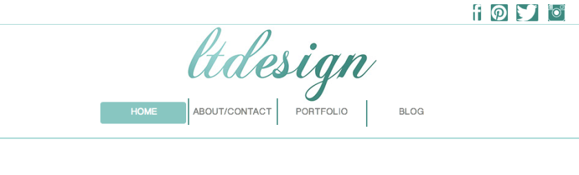
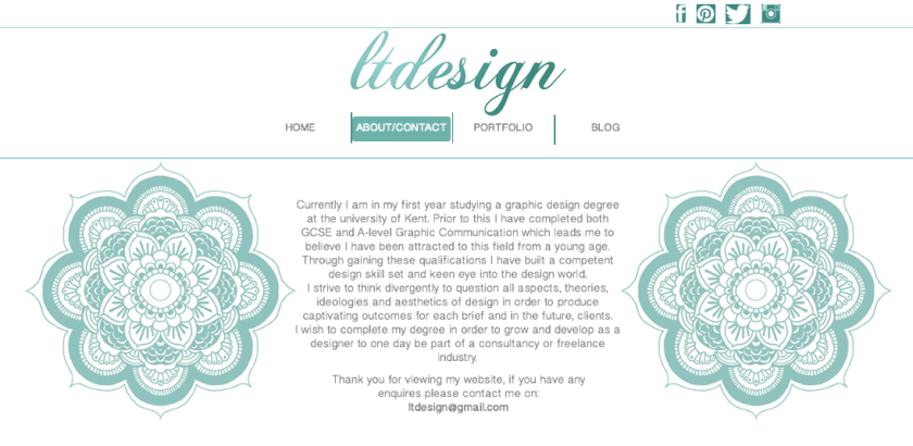
The accent colour I have chosen to use for my website is a shade of turquoise. I have chosen this for many reasons, the first being that it is not gender specific and therefore will not make my webpage look to masculine or feminine. Also there are many signifiers of the colour turquoise, these being:

  • Tranquility
  • Peace
  • Creativity
  • Calming
  • Sophisticated

This therefore portraying how I would want my audience to feel when looking at my website. I would want them to feel at ease and not feel that the pages where overpowering and in your face. Also I would want my audience to feel creative after looking at the work in my portfolio in order to feel inspired or motivated to contact myself to make an enquiry or become a client.

Persona:

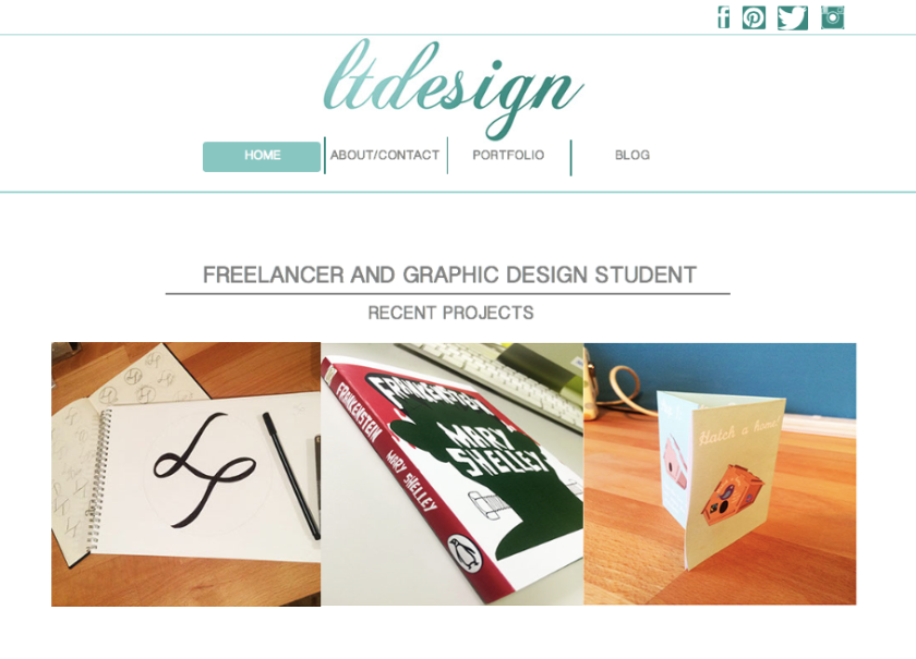
The ideal persona for my website would be someone like myself, someone who may already be a designer whether new or experienced or someone who has an interest in design and is looking for someone to create a piece for them. Within my website I have ensured that I am able to provide to my audience by showcasing examples of my previous work with a caption explain what each topic is about and the outcomes made from this.

Also my contributing social media icons in the header it shows that I have accounts that I regularly post and update meaning that if a user had a particular interest in my work they could follow me on one of these accounts. In addition to this a potential user of my website may of found my hyperlink when looking at one of my social media accounts in which has directed them to my website.

An example of a persona would be:

Name: Lucy

Age: 25

Location: Kent

Occupation: Landscape gardener

About: Lucy is a landscape gardener who is looking to start her own business by herself. Therefore she is looking for a graphic design to brand her company and design her a logo, business card, letterhead etc..

Lucy is a good example of a persona for my website because she may of been able to find my address through using the digital media of Instagram using the hashtag tool. This therefore could have directed Lucy to my website in which she was able to look at my previous outcomes, in particular the work upon branding and natural perfections which is able to relate to her idea of branding landscape gardening well. If Lucy decided that she liked my work then she could contact me using the email address given in the contact page.

Experience design:

Being a website for myself as a aspiring graphic design it is important for the audience to have a good experience design in order for them to be able to entice them to want to use my services. Therefore I have included many elements to give my user a good experience when navigating around my website.

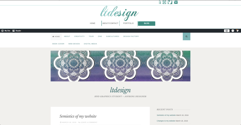
Firstly on the homepage I have clearly established the name of my brand in the header and who am using the tagline ‘freelancer and graphic design student.’

In the header itself the menu buttons showcase a rollover feature which allows the a box to surround the word, altering the text white and creating a gradient effect as the buttons more across the page, this mirroring the above title. Also within the header contains social media links by using their logos, when the user rollover each one a lightly coloured box surrounds the icon to indicate to the user what icon they have chosen and will be directed to.

Underneath this shows examples of my most recent projects, this being a good and interactive feature as it can be updated at any time and also because it includes the rollover effect of showing a grey opaque box over the image with white writing explaining the name of the piece and its topic. Also these images are able to hyperlink to the necessary portfolio page.

When on the portfolio page, more grey rollovers have been introduced in order to indicate to the user what each image relates to. These images again hyperlink to the necessary page in which the work is located in this either being 2013/2014 or 2015/2016.

The specific portfolio pages use the interactive use of slideshows to show different pieces of work in which relate to each topic along with the outcome that was produced at the end of the topic. This is a good example of experience design because the user can either watch the slideshow translate to each slide or they can navigate through the images themselves by using the navigation dots.

By using the different features of hyperlinks, rollovers and slideshows I have been able to make my website highly interactive for my users in order for them to gain an experience and remain interested throughout.