Evaluation and reflection

Visual communication:

  1. I feel that my outcome has met the needs of the brief as I have successfully built a web-based portfolio to showcase my design work. I have also been able to record all of my technical processes and research in order to explain how I made conclusions and choices for my outcome.
  2. I feel that my outcome fails to meet the needs of the brief as I have not sampled my webpage in different browsers, this being something that can be done through downloading another browser or opening the file in a different piece of technology for example on a tablet or smartphone.
  3. I think that my strengths of my outcome can be shown through the amount of thorough research I carried out in which enabled me to make in depth design choices and solutions.
  4. The weakness of my piece is that I was unable to make the webpage as interactive as I would liked for smaller devices such as a tablet or smartphone due to the timeframe given.  I would have liked to add an accordion menu when the website is used in a smaller device in order to make it more manageable for the user to navigate.
  5. I feel that my piece could be improved practically by adding more content, for example on the home page more subheadings could be included to make the page longer. However as this is only the beginning of my website this is something that can be developed as I grow as a designer as there will be more content I can include to my webs page for example concerning work, contact details and clients.

Refection:

  1. I feel that through being given this brief before half term my time keeping was successful as I was able to compete a large amount of my research and website analyse during this period. This therefore being beneficial as I was able to concentrate on the design of the website when in lessons where I could ask for feedback.
  2. My research for the brief was very thorough as I analysed 10 existing design websites before considering the design of my own. I also carried out research upon digital media, for example what it is, examples and how it has changed the way in which we communicate/live. This enabled me to gain an understanding as to what does and does not work well on webpages and whether specific features or elements are more effective than others. By making conclusions from my research  I was able to merge elements from different websites together in order  develop my own ideas to make mine as successful and functioning as possible.
  3. I think that I was able to use experimentation during this project by choosing to make my website in Adobe Muse. The reason behind this is because it is a software in which I have not used before and therefore learnt how to use the software through watching various tutorials and downloading different widgets. With more time and practice using the software I think that I could make my webpage even more effective and interactive.
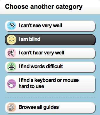
  4. I felt that for the web design outcomes for this brief I have been able to show that I have achieved them by demonstrating an understanding of the structure and function on internet design, browser function and web page publishing through the research in which I have constructed before designing my website. I have also considered the accessibility of websites and how I could make mine accessible along with being able to design, plan, build, test and evaluate a set of functioning web pages. Concerning the digital media Learning Outcomes I have successfully been able to produce and develop an understanding of current digital media concepts and technologies along with researching skills relevant to the themes of the module. Through the creation of my webpage I have begin to develop design skills combining various disciplines and media and understand computer applications and their creative use. I think that to improve upon these Learning Outcomes I could have experimented further with accessibility and how to practically make a webpage accessible for more users. Also to develop more of an understanding of the components of a multi-medial production and how they interact.
  5. I enjoyed this brief as web design is a field I have considered  to work within after my degree. Therefore I feel that by carrying out this brief I have more of an understanding of what web design consists of and how it can be achieved.
  6. The parts of the brief in which I enjoyed the least would have been the analyse of the existing design website, the reason behind this purely being because it was very time consuming and needed to be thorough.
  7. I was mostly inspired by the research in which I carried out on existing design and portfolio websites. The reason behind this being that it helped me decided upon my content, layout and navigation of my webpage to ensure that it is easily accessible for the user whilst looking attractive and engaging.
  8. The most challenging part of this brief was making the website as Muse is a software in which I was unfamiliar with in the beginning. However after watching tutorials and carrying them out I was able to work with the software well and understand all the features within it.
  9. I think that with further practise within Muse I will be able to develop and improve my website further in order to make it more interactive and accessible to users which in turn will entice them to want to contact me and enquire for my services.


Final webpages

Here are screenshots of my final webpages and some examples as to how they interact.

Header:

Screen Shot 2016-03-18 at 20.18.28

My header uses many features in which makes it interactive for the user. Firstly the brand name is placed in the centre of the page in order to be the first piece of text in which the user will read. Below this features the menu which includes and rollout of further links to visit. The social media links are held in the top corner ensuring that they are visible at all times through being in the header whilst also use a turquoise background colour that changes to a lighter colour when hovered on. The menu also uses a rollover feature that uses the gradient of colours held in the brand name, this adding detail and interest to the piece. Lastly the header is separated using the detail of fine lines, this enabling to show where the header begins and ends.

Homepage:

Screen Shot 2016-03-18 at 20.19.05

I wanted my homepage to fit to the size of the screen to ensure that the user was not scrolling through reams of information on the first page they saw as this could become boring and make the remaining website seem uninteresting if there is a lot of content to the first page. Therefore I have included a tagline to give the user a brief explanation as to who I am along with a snapshot of some recent pieces I have developed. This I feel is an effective feature as it is something that can be altered and developed as new projects get completed along with the fact the the imagery is hyperlinked leading the user to be able to go straight to the page with that piece of work on. These include the rollover feature as seen in the middle image which use both typefaces, the script that has been used for the name and also the typeface used for the menu and other body copy elements in each page. I think that the merge of blue and grey makes the page look refreshing and also professional.

About/contact page:

Screen Shot 2016-03-18 at 20.19.54

Again my about page fits to the size of the screen in order to remain the users focus on the text written in the centre of the page. Using a central align means that the text can fit directly below the menu whilst also directing the user to the information straight away. The use of the mandala decoration add interest to the piece whilst also contributing some balance and harmony in which fits in with the colour scheme of the website, this therefore making my website more memorable and recognisable. The about/contact page is something I wish to develop over time, this being to separate the pages and contribute more elements to the contact information.

Portfolio page:

This page does not entirely fit to the size of the screen with the social media links missing to be able to see all of the imagery on the page. The propose of this page is so show examples of my work as to when they were made which follows with the imagery being hyperlinked to the necessary page. Again these images use the feature of a rollover in order to give the user further information as to the topic in which they relate to.

2013/2014 and 2015/2016:

This page does not fit to the size of the screen as there is a lot of information held within it. At the top of the page there is a title to state the years in which the work was made to which leads to the slideshows below showcase the work within each topic leading to each outcome. I think that by alternating the side in which the slideshows are placed makes the webpage look more interesting and less repetitive, whist also give the user more to look at one given time. Using the same format for both pages creates consistency and recognition to the user, allowing them to navigate both page with ease in order to see the developments in which I have made. Again this format is easy to use and duplicate meaning that more pieces and outcomes can be added over time as they are produced allowing the user to preview more examples of my work.

Blog page:

Screen Shot 2016-03-18 at 20.12.11

The last page in my website features the use of some HTML coding, this being a direct link to my WordPress blog whilst remaining on my website. This is something I wanted to achieve because it means that the users are able to remain on my website if they wanted to go back to anything on another page whilst also be able to view my blog which is able to update itself every time the link is used, meaning that each new update is seen for the users in order for them to be able to view what I am currently work on etc..

Semiotics of my website

After completing and finalising my website I can now discuss the semiotics behind my choices and how they are able to impact my design.

Colour scheme:

screen-shot-2016-03-17-at-14-04-21

The accent colour I have chosen to use for my website is a shade of turquoise. I have chosen this for many reasons, the first being that it is not gender specific and therefore will not make my webpage look to masculine or feminine. Also there are many signifiers of the colour turquoise, these being:

  • Tranquility
  • Peace
  • Creativity
  • Calming
  • Sophisticated

This therefore portraying how I would want my audience to feel when looking at my website. I would want them to feel at ease and not feel that the pages where overpowering and in your face. Also I would want my audience to feel creative after looking at the work in my portfolio in order to feel inspired or motivated to contact myself to make an enquiry or become a client.

Persona:

The ideal persona for my website would be someone like myself, someone who may already be a designer whether new or experienced or someone who has an interest in design and is looking for someone to create a piece for them. Within my website I have ensured that I am able to provide to my audience by showcasing examples of my previous work with a caption explain what each topic is about and the outcomes made from this.

Also my contributing social media icons in the header it shows that I have accounts that I regularly post and update meaning that if a user had a particular interest in my work they could follow me on one of these accounts. In addition to this a potential user of my website may of found my hyperlink when looking at one of my social media accounts in which has directed them to my website.

An example of a persona would be:

Name: Lucy

Age: 25

Location: Kent

Occupation: Landscape gardener

About: Lucy is a landscape gardener who is looking to start her own business by herself. Therefore she is looking for a graphic design to brand her company and design her a logo, business card, letterhead etc..

Lucy is a good example of a persona for my website because she may of been able to find my address through using the digital media of Instagram using the hashtag tool. This therefore could have directed Lucy to my website in which she was able to look at my previous outcomes, in particular the work upon branding and natural perfections which is able to relate to her idea of branding landscape gardening well. If Lucy decided that she liked my work then she could contact me using the email address given in the contact page.

Experience design:

Being a website for myself as a aspiring graphic design it is important for the audience to have a good experience design in order for them to be able to entice them to want to use my services. Therefore I have included many elements to give my user a good experience when navigating around my website.

Firstly on the homepage I have clearly established the name of my brand in the header and who am using the tagline ‘freelancer and graphic design student.’

In the header itself the menu buttons showcase a rollover feature which allows the a box to surround the word, altering the text white and creating a gradient effect as the buttons more across the page, this mirroring the above title. Also within the header contains social media links by using their logos, when the user rollover each one a lightly coloured box surrounds the icon to indicate to the user what icon they have chosen and will be directed to.

Underneath this shows examples of my most recent projects, this being a good and interactive feature as it can be updated at any time and also because it includes the rollover effect of showing a grey opaque box over the image with white writing explaining the name of the piece and its topic. Also these images are able to hyperlink to the necessary portfolio page.

When on the portfolio page, more grey rollovers have been introduced in order to indicate to the user what each image relates to. These images again hyperlink to the necessary page in which the work is located in this either being 2013/2014 or 2015/2016.

The specific portfolio pages use the interactive use of slideshows to show different pieces of work in which relate to each topic along with the outcome that was produced at the end of the topic. This is a good example of experience design because the user can either watch the slideshow translate to each slide or they can navigate through the images themselves by using the navigation dots.

By using the different features of hyperlinks, rollovers and slideshows I have been able to make my website highly interactive for my users in order for them to gain an experience and remain interested throughout.

How to make my website accessible

There are various ways in which a website can be made accessible as evidenced in the previous posts however as I am only designing my website and not necessarily publishing it there are limited features in which I can add in order to make it accessible.

This being said, if I were to publish my website there are multiple and simple features and techniques I could use to ensure it is accessible for all users. For example:

  • Good use of HTML headings
  • Accessible with keyboard
  • Accessible images
  • Accessible menus
  • Accessible forms
  • Accessible tables
  • Effective use of color
  • Meaningful link text
  • ARIA landmark roles
  • ARIA for web applications

There are also many ways in which a website can be checked to ensure that it has been made accessible. These include:

  1. Validating HTML. If HTML is used incorrectly, assistive technology can have problems interpreting the page content, which can result in access problems for the users.
  2. Test with a keyboard by setting your mouse aside and use the tab key to navigate through the web pages. All interactive features such as menus, links, form fields and controls should be be accessible.
  3. Use an  online accessibility checker which will check the web pages for accessibility.
  4. Test with users by recruiting and observing the users to see how they are able to interact with the site.

(Source: http://www.washington.edu/accessibility/web/)

Example of an accessible website

Having carried out doe research upon the accessibility of websites, I was able to find an example of an website in which does this.

The BBC website ensures that it is accessible for the disabled through enabling different features to its pages.

Screen Shot 2016-03-10 at 17.40.12

Above shows a feature in which allows the text size and colour of the website to be altered for those who may have a slight visual impairment or are colour blind. Therefore by using this feature the user can adjust the type to a size they can read and also alter the colour contrast to make the website easier to view.

Screen Shot 2016-03-10 at 17.42.16

When on the ‘my web my way’ page the user is able to select an option which applies to them, for example whether they are blind, deaf or unable to use the mouse or keyboard very well.

This then takes the user to different options for example how to turn on ‘text-to-speech’ or how to use voice recognition.

(Source: http://www.bbc.co.uk/accessibility/best_practice/what_is.shtml)

Carrying out this researched has shown myself how existing websites are made accessible for the disabled and therefore whether I am able to include features such as these to my own webpage.

Accessibility of websites

Within the brief it states to consider the accessibility of our websites and whether we are able to make them accessible or not to all users.

Therefore I have carried out some research upon the accessibility of websites and how this has grown.

Web accessibility allows people with disabilities to perceive, understand, navigate, interact and contribute with the web. It can also benefit others such as the elderly with their changing abilities due to ageing.


Web accessibility encompasses all disabilities that affect access to the web, including visual, auditory, physical, speech, cognitive, and neurological disabilities. However at present, most websites and web software have accessibility barriers that make it difficult or impossible for many people with disabilities to use the Web. It is important that the websites and softwares being to become accessible in order to prove equal access and equal opportunity to people with disabilities, whilst also allowing them to actively participate in societies.  It can even be required by laws and polices that organisations have accessible websites for all.

Making a website accessible can be simple or complex, depending on many factors such as the type of content, size, complexity of the site, development tools and environment. Many accessibility features are easily implemented if they are planned from the beginning of website development or redesign. Fixing inaccessible websites can require significant effort, especially sites that were not originally “coded” properly with standard XHTML markup, and sites with certain types of content such as multimedia.

How to make a website accessible:

Assistive technology allows websites to be made accessible for the disabled, for example:

  • Alternative keyboards
  • Voice recognition
  • Word prediction
  • Keyboard navigation
  • Transcripts
  • Sign language visual
  • Screen reader
  • Spelling and grammar tools
  • Eye tracking
  • Keyboard and mouse customisation

1

Web developers use authorising tools and evaluation tools to create web content which allows the users to use their browser and assistive technologies to be able to interact with the content.

(Source: https://www.w3.org/WAI/intro/accessibility.php)

Unfortunately the websites in which I have researched for this project do not have an accessibility features and therefore may not be able to be used for the disabled. This is something in which all companies and web designers should consider as it could lower the demand for their websites if some users are unable to interact with them.


Big Bang Data – digital media

After going to the Big Bang Data exhibition I was able to use of of the exhibits held in order to relate it to a piece of digital media.

This exhibition was called ‘I know where your cat lives’ and is an investigation into how posting an image online, for example of your cat can lead to also revealing further personal data for example your address.


I Know Where Your Cat Lives is a data experiment that visualises a sample of 1 million public pictures of cats on a world map, locating them by the latitude and longitude coordinates embedded in their metadata. The cats were accessed via publicly available APIs provided by popular photo sharing websites. The photos were then run through various clustering algorithms using a supercomputer at Florida State University in order to represent the enormity of the data source.

This project explores two uses of the internet: the sociable and humorous appreciation of domesticated felines, and the status quo of personal data usage by startups and international megacorps who are riding the wave of decreased privacy for all. This website doesn’t visualize all of the cats on the net, only the ones that allow you to track where their owners have been.

(Source: http://iknowwhereyourcatlives.com/about/)

Although this exhibit has been made in a humorous way, it highlights the importance of how any image can potentially be tracked down as to where it was taken and who by as seen on their personal account.

From a designers point of view this may be positive or negative as clients would want to know that the research used for their piece is legit and has been conducted by the designers they have chosen to work with.

Big Bang Data

Today we took a trip to Summerset House to visit the exhibition Big Bang Data. As the name suggests the exhibition was all about data and explores the issues surrounding the datafication of our world through the work of artists, designers, journalists and visionaries. The exhibitions were able to generate an understanding with our relationship with data but also explore the meaning and implications of data for our future.

Everyday we each produce data in huge quantities for example through emails, selfies, online shopping and Google searches. This online activity has therefore led to a massive explosion otherwise known as the ‘Big Bang’ of data. This radical shift in the volume, variety and speed of data being produced combined with new techniques for storage, access, and analysis is what defines the proliferation of data. All of this then radically reshaping our world whilst also being set to revolutionise everything we do.

(Source: http://bigbangdata.somersethouse.org.uk/an-introduction/)

An exhibit in which signifies how powerful data really is was called ‘How much fossil fuel has been used in your lifetime.’ Its purpose was to use interactive visualisation data to raise awareness about climate change. By using iPads to display the data it powerfully places the audience at the centre of the data models to create an emotional and engaging experience. The data interacted with the audience by asking them to type their age, this then calculated the amount of fossil fuels in which had been extracted or burned in the users lifetime. It also contextualised the alarming rate of current fossil fuels by showing that real changes will occur in our lifetimes and not just in the future.

IMG_5094

Another exhibit in which I found interesting was called ‘Dear Data.’ Two artists living on either side of the Atlantic collected and measured a particular type of data relation to their lives every week by visualising the results on the back of postcards which they sent to each other. By thinking of a new topic each week such as how many times they check the time or how many times they are complimented, they had to think of new ways of presenting what they had found, this often resulting in very complex and detailed diagrams or drawings. By creating and sending analogue data rather than digital data visualisations, the artists show how collecting and representing data can be treated as a normal everyday activity which does not need to be complicated or made intimidating by digital means.

This exhibition is able to relate to our current topic of digital media as all types need a large amount of data used in order for them operate. From this I intend to research further into digital media, how it links to data and how data is specifically used to make it possible.

Logo design

As the final outcome for this piece is to produce a website for ourselves as designers showing a portfolio of our work, I decided that I wanted to have my own logo.

To gain inspiration for my logo I looked  on the digital media resource of Pinterest which I found existing templates and examples, some of these shown below:

(Source:https://uk.pinterest.com/search/pins/?q=logo%20design&rs=typed&0=logo%7Ctyped&1=design%7Ctyped)

Using this inspiration and divergent thinking I began drawing various thumbnails and designs varying in shape, texture and type.

From these I then drew up the most successful ones larger and with more precision.

Doing this indicated a clear theme within my preferred style, this being the use of a script type and circular shape.

After asking for opinions from peers, the most popular and my personal preferred design was this one: Screen Shot 2016-02-27 at 17.17.26

The reason behind this being because it is the boldest and therefore stands out the most. It is also a fairly contemporary design however works well to merge my initials of LT together.

After choosing a design, I begun to play around with is and decide character styles and size worked best. In the left image I experimented with different character styles as I did not want the ‘T’ to be mistaken for a ‘J’. I also experimented using straight lines to spell out the initial however I do not think this design is obvious enough and it also looks fairly masculine. I therefore decided to remain with the script typeface ensuring that the tail on the T is not too exaggerated in order for it to be clearly read and not mistaken. In the right image I have experimented as to where the word ‘design’ fits best and is clearly read. I used a mix of both upper case and lower case in order to make a statement but also combine with the initials text. I think the best outcomes for this are  when ‘design’ is written above or below the circle and also when it is written within the circle as this adds an unique twist.

FullSizeRender-2 copy 3

After deciding upon a logo design I firstly drew it out on a large scale in order for it to be scanned and edited within professional software.

I began by opening the image in Photoshop to remove the background, this being achieved by using the colour range tool.

I then moved this into Illustrator where I was able to draw around the image using to the pen tool to create a new layer and make the piece more editable in this software.

Following this I made a circle to support the piece and began using type and editing its positioning. In order to make the type sit around the circle I used the ‘type on a path’ tool. I chose to use the type which is written in line with the circle as I think it completes the piece and makes the type look like it belongs to the vector.

After choosing a composition in which I was happy with I began looking at different typefaces within the software in which would fit the circle and make the word flow within it. This therefor meaning that the typeface has to be script in order for the loops and serifs to join each end of the circle.

13 cut out circle

Above shows the underneath part of the circle been removed using the slice tool. This gives the effect that the text has been written in line with the circle in order to complete it.

Screen Shot 2016-02-28 at 12.24.02 
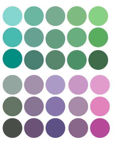
The next step to create my logo was to add colour, to do this I made a colour scheme in colours in which I like and think compliment each other well. I firstly chose the middle colour in each row and then added a lighter and darker shade to this. The theory behind this was to use a row of colour to add dimension rather than one block colour which could flatten the piece.

22 all together

Here I have applied each row to the logo using the darkest colour for the initials, the middle colour for the text and the lightest colour for the circle. The colour in which I have chosen is the bottom left (turquoise) the reason behind this is because I think it is the one that stands out the most, being the brightest and not necessarily the darkest such as the grey in the top right. I think that the green shades could easily relate to recycling or the environment at first glance, this being something I want to avoid as it is something in which is not specific to my website or myself. Within the turquoise circle I also edited the size of the initials for it to be compared with the original size. I think that the initials made smaller looks better because it creates more atmosphere and does not make the piece look too busy and confined.

After being happy with the colour, I wanted to alter the typeface used in order for it to relate more effectively with my initials. Therefore I used dafont.com and found a type face in which is thicker and able to fit the design more adequately.

thicker cirlce

Here is my final logo, I made some slight changes to the circle by making it thicker allowing it to stand out further and become a distinctive outline. I plan to place this on my webpage ensuring that this is the first thing in which the user sees, therefore placing it in the top left hand corner. I will also create a link in my webpage will which make the logo link back to the home page as this is a very common convention with users and something many are familiar with.

Carlos Garde Martin

Today we had a workshop with Carlos Garde Martin, an illustrator from Brighton who has been a professional since 2009. His vibrant and unique style has caught the eye of many different brands and contractors such as Network Rail, Shell and Citroën. Carlos produces hand drawn illustrations with synthetic colouring in which has allowed him to gain a successful reputation for his bright and intriguing artwork.


(Source: http://carlosgardemartin.co.uk/382371/5504355/portfolio/various-typography)

Carlos’ workshop was based around divergent thinking and how to generate ideas using various methods and in short bursts.

One of the first activities we carried out was in groups where we were each given a category and had to draw as many things within that category as possible in the form of a spider diagram.

FullSizeRender-4
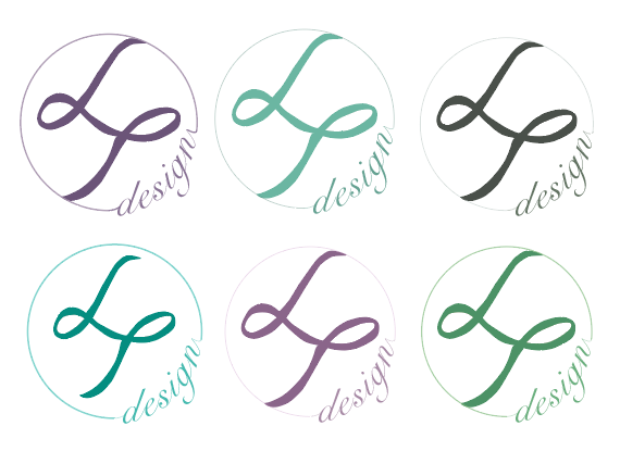
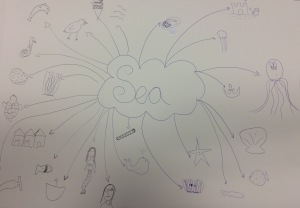
My partner and I were given the category of sea in which we were able to think of many relations to. (as seen in the image) For example animals from the sea, items relating to the seaside and also mythical creatures such as mermaids and pirates.


Next we were able to take this a step further and use words along with imagery. As a group we began with a word and then branched off of this, for example the word being ‘orange’ branched off to Holland, sunsets, holidays, clapping etc..

FullSizeRender-3
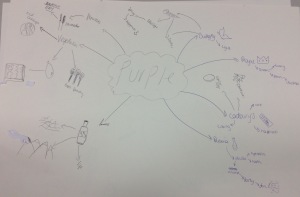
We then carried out this activity again within our groups allowing the original word to branch off into completely diverse and different meanings to the beginning word. When carrying out this task we began with the word purple and were able to branch off into subjects such as Cadbury’s, mountains and Christmas.


Another divergent activity in which was carried out was to demonstrate a word given to us using just cut up or ripped paper. The word was a feeling and therefore we were unable to use faces to signify it.

FullSizeRender-5
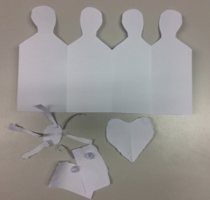
The word I was given was ‘happiness’ which demonstrated without using the obvious smile was by using signifiers. With the paper I made a heart shape (love) , a sun (hot weather), some money and a chain of people (friendship) to signify things in which makes you happy. This activity was interesting as we were able to see and guess what each others word was but also how we are able to work quickly in an unusual way.


My favourite activity was carried out on the white board in which we were given an image to begin with the had to draw the first thing that came into our mind from that image, taking it in turns to go around the group. This has very interesting results as we began we a floppy disk and resulted with a ghost. Carrying out activities such as this is a good way to think divergently as it shows how images and subjects are able to link together in one way of another, this then helping to find a result for an idea.

I found Carlos’ workshop very enjoyable and inspiring through the activities in which we carried out and the skills in which he showed us. Although divergent thinking is something in which I had been previously doing, I think that by carrying it out it groups was helpful and something I intend to do in the future as you are able to bounce off each other to get more and more ideas or even some that you would not of been able too alone.